
CADENCE
CADENCE
This is my double page spread research page. Below I have researched and analyzed the double page spreads from different music magazines to see the similarities and differences between them. By doing this research it will help me to plan a layout for my magazine and it will also help to inspire and influence my magazines double page spread.


NME double page
This is a double page spread from an NME magazine.
NME have used one page to show a photograph of the band that is featured in the text.
Part of the text is in green text box to highlight and bring attention to the text.
NME uses typography in the article the letter S is larger and this is used to start the article off.
This article is written in columns to show how Kasabian plan to move forward and continue with producing music.
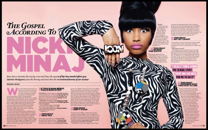
Billboard double page
This is a double page spread from Billboard magazine.
Billboard uses a photograph of a solo artist in the middle of their text, the image used spreads across the double page and covers up some of the title where her name is in large pink capitals.
The text in the article is structured to surround the artist and doesn't go over the top of her.
Billboard uses different font and colour for title to the artist name.
The article is in an interview layout and in this format it is clear to see that the questions are in bold. This helps the readers to distinguish the interviewer to the artist. The bold also helps to define the question from the answer. Parts of the text are in pink to draw attention to it.

Q double page
This is a double page spread from Q magazine.
One of the pages is a close up photograph of the featured artist.
The other page is covered with text. There is a large font for the title and letter T is enlarged for emphasis.
The article is written as a story of how the artist began producing music. The article is writen in columns to help show that this it is not an interview with the artist.
I think that this helps to capture the attention of the readers.
Q also uses it's logos at the bottom left page where the text is.

NME double page
This is a double page from NME.
I like how one page is taken up by an image and the other is full of text.
I like how the title is very large and therefore makes the readers also notice the text instead of just the image. I intend to try this layout for my double page spread.
I like that the image is taken in black and white as I think that it contrasts well with the bright colours used on the next page. I intend to try the black and white effect with the image I will use for the double page spread.
To show a link with the colours and the black and white image NME have place a text box near the artist. I think that this could help the rader to connect the artist to the article.

Mojo double page
This is a double from Mojo magazine.
I like how both pages have images on them and how the text is written towards the center of the two pages. I think that the composition of the pages makes the readers look more towards the text. I intend to try this for another idea of how I could layout my double page spread.
I like also how the image has been taken in black and white. I intend to try this effect on my images for the double page spread.
I like that the text is broken up into the introduction then the middle and then at the end the text is separated again. I think that this is done successfully by using different colours and fonts to make the different parts stand out to the reader.